Dear Moderator

Hello and welcome to my blog, you will find that on this blog, of Hannah McGrail, there is research and planning. I hope you thoroughly enjoy yourself whilst you're reading through my work which I spent much time on creating for you.
You will find moderator, that the research and planning begins in September and my final magazine piece, is below this.
Thank you and enjoy Moderator :)

Monday 26 March 2012

Completed Magazine.


Evaluation - Question 1 Front Cover.


                                            Use. 

The OREN sign was placed in the middle of my magazine and copied the stroke of the 'Biffy Clyro' as I liked the appearance. I also copied the subheading idea, and the background of the subheading. For this I used brusheeze on the internet and downloaded what I thought was a suitable and matching brush, and I think this added the same effect to emphasize the genre of my magazine, despite using a different colour due to my house style. 

I copied the poster idea, as I seen that on the Kerrang the spacing was very compact and tight, I seen that all the space was taken up. I wanted to copy this and thought that the poster idea, was ideal to my magazine as not only would it attract people, but due to the shot type, and colour surrounding the posters it was matching to the genre.

I finally used the idea of the + sign and the listing of the bands which are to be in the magazine, also placed at the same position of which the Kerrang magazine had chosen, as once again I thought it was a good way to take up the space, and make my magazine look more compact and as space consuming as my magazine influence. 

                                      Develop 

I chose to have a single shot instead of a group shot, purely because I thought if there was one person in the framing then it would provide more space to put subheadings, I was also trying to avoid it looking identical to the Kerrang magazine.

With the exclusive section of the magazine I decided to place it in a different place on the magazine as the spacing from the front cover looked too much in the corner where the kerrang had chosen to place the exclusive. I also chose a different font and shot type to make my magazine appear different.

For my masthead I had chosen to have a different font style and a different colour to make my magazine more original and matching to my houses style, also if I had chosen to do black it wouldn't stand out as much on my magazine.

                                                               Challenge

I chosen a different shot type for the main picture on my magazine. I decided to go for a long shot in comparison to the Kerrang magazine which was a medium shot. I had chosen a long shot as I thought that the clothing that was on show would express the genre of the magazine.
   

Evaluation question 1 double page spread


                                                                         Use

The shot of the 3 group people i copied as I liked the group effect, and the rest of my magazine was mostly solo photos so to make it varied I thought i should have a group image. I've also copied them by having my models do the same poses, just like they are in Q magazine.

                                                                      Develop

The magazine names are positioned in the same placed at the top, however on the Q magazine their name is a lot bigger than mine, mine is only small to make sure it isn't a big focus and doesn't take attention away from the band.

The text name and the introduction are positioned differently and are of a different size, however did copy their style but developed it by using my own font, size and design on the double page spread.

The text position of the actual story is also positioned differently to make the double page spread look like it was in columns so i put the text in that position. I also used different colours to suit the house style.

                                                             Challenge

I changed the coloring of the pictures and instead made mine black and white as i liked the technique and thought that it would make my magazine look original and different to others. 

I also placed the text over the middle of the picture, instead of at the bottom as I wanted it to look like it was taking up space and compact to match the genre of the magazine.

Evaluation - Question 1 Context.


                                                                      Use

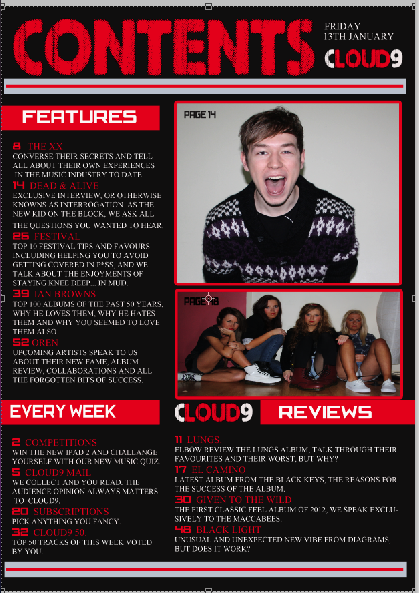
I used the picture positioning from the nme magazine on my magazine as I think it looked good on the nme and wanted it for my magazine. I also like how the positioning causes it to be the first thing that is seen when you see the contents and so would attract people when they see it. 

I used the subheadings from the nme as I wanted my headings to stand out on my background, I also used it as it easy to see the section of the magazine that you might be looking for.  It was also good as it was matching to my house style.

I used the layout from the nme magazine on my magazine as I wanted it to be clear what was in the magazine and I also think it was suiting to the genre of the magazine as it wasn't all compact like the front cover was, instead it was easy to read and see what is inside. 

                                                                Develop 

I developed the background of the magazine as I think that the black colour was more suiting to the rock genre, the white wouldn't have had the same effect. As nme is a more subtle rock genre, unlike mine.

                                                             Challenge

I challenged the shot type by using two pictures instead of one as my main. I used a medium close up as appose the extreme long shot of the band. I used the medium close up as I think it looked better for a solo shot, the long shot looked good as it was a group.

The title of 'contents' was different as mine was much bigger, as I wanted to make the colour stand out on the black background so the context page didn't look too dull. I also thought that the font of the contexts expressed the genre of the magazine well.

Evaluation - Question 2


  • My picture on the left, imitates the one on the right due to them both being black and white, however I didn't use the background as due to my house style, it wouldn't have looked right and would have appeared to be too dark for my double page spread. The contrasting on my picture is slighter darker than that on the right, this could be due to the colour of clothing which they was wearing when the picture was taken. The contrasting of my picture matches the rest on the page, just like the picture on the right matches that of the other photos from the picture I had taken this from.
  •  The shot type for both pictures are the same, I wanted a long shot to be used so that I could use the clothing worn to convey the genre of the magazine, just like the one of the right did, from the picture I had taken this from. The angle is also the same, I chose eye level so the reader would get a full on view of the model. 
  • The expressions of both of the models are the same, they're both using the same gestures by covering their face, however not as much on the right as on the left. I didn't use a prop on my picture, as I didn't think it was necessary for my pictures, I wanted to keep it simple as there was already too much on my double page spread, the masthead and subtitle would also have been covering the props anyway. They are stood in the same position, the only exception is that my model has their legs crossed, to make the model on the left look more feminine. 
  • The costume on the pictures aren't the same, however one is male and the other is female. Therefore I thought i should present the female model to look more feminine however still maintaining the expressions of the genre. Both however are wearing pants and a top, their colours differ, however it doesn't really matter as the picture ended up being black and white anyway.

Friday 23 March 2012

Question 3 Evaluation Double Page Spread

Double Page Spread by McGailHannah
Double Page Spread, a photo by McGailHannah on Flickr.

Click on image above, to take you to answer. 

Question 3 Evaluation Contents

Contents by McGailHannah
Contents, a photo by McGailHannah on Flickr.

Click on image above, to take you to answer.  

Question 3 Evaluation Cover

Cover by McGailHannah
Cover, a photo by McGailHannah on Flickr.

Click on image above, to take you to answer.  

Evaluation - Question 4


This is my target audience because my magazine is a rock alternative genre and so therefore would suit this stereotype audience member most, compared to another stereotype who may like pop music. She is also the same age as some of the people pictured in the magazine, on the double page spread. Therefore this would relate to her more. She is also dressed in the same style as the artist in the magazine.

Evaluation: Question 6- What have you learnt about technologies from the process of constructing this product?


Blogger - To document my research and planning, and my evaluation. 
Prezi - To document who the target audience is, and help me on question 5.
Photoshop - For the construction of my magazine
Flickr - To help me with question 3 of my evaluation. 
Iphoto - To upload the pictures that I needed for my magazine.
SLR camera - To take the pictures.
Indesign - Contents for my college magazine. 

Evaluation: Question 7 - Looking back at your preliminary task, what do you feel you have learnt in the progression from it to the full product?

Question 6 example.

Ishowu - Changing contents colour